
 By
kingsly jebaraj
By
kingsly jebaraj Your website is likely the first interaction customers have with your brand in a digital-first world. One of the first tips for your site is that if it does not function perfectly on all your devices, you could lose visibility and revenue. This is the reason why a responsive WordPress website is important for businesses aiming to improve SEO, usability, and conversion rates. A responsive site not only looks appealing but also works smarter, loads faster, and seamlessly adapts to the way users browse in 2026.
What is a Responsive WordPress Website?
Definition of responsive design
A site created according to responsive web design basics, where the layout scales according to the screen. Users are able to experience a similar and friendly user experience regardless of whether they visit from a smartphone, a tablet, or a desktop computer.
How responsive websites adapt to different devices
The mobile-responsive website adjusts content dynamically with flexible grids and images, using CSS media queries. Text, images, and buttons resize and reposition according to the device used, with no pinching, zooming, or uncomfortable scrolling needed!
Responsive vs Mobile-Only Design: The Difference
A responsive design uses one layout system to scale across all devices, but a mobile-only design creates a separate replica for mobile users. Responsive websites are faster, scalable, and more SEO-friendly than the separate versions of a site.
Why Responsive Website Design Matters in 2026
Rise of mobile users
In fact, global internet traffic is still led by mobile use. Having a mobile-friendly website has become an absolute necessity for businesses to survive, as more than half of users browse only on their mobiles.
Multi-device browsing behaviour
People frequently hop between devices during the day, from mobile to tablets to desktops. The significance of the importance of responsive web design is to provide a smooth transition across all touchpoints.
Google mobile-first indexing
Search engines now favour mobile versions of websites. With mobile-first indexing, optimising your mobile site is now your best chance to succeed in SEO.
Benefits of Responsive WordPress Websites
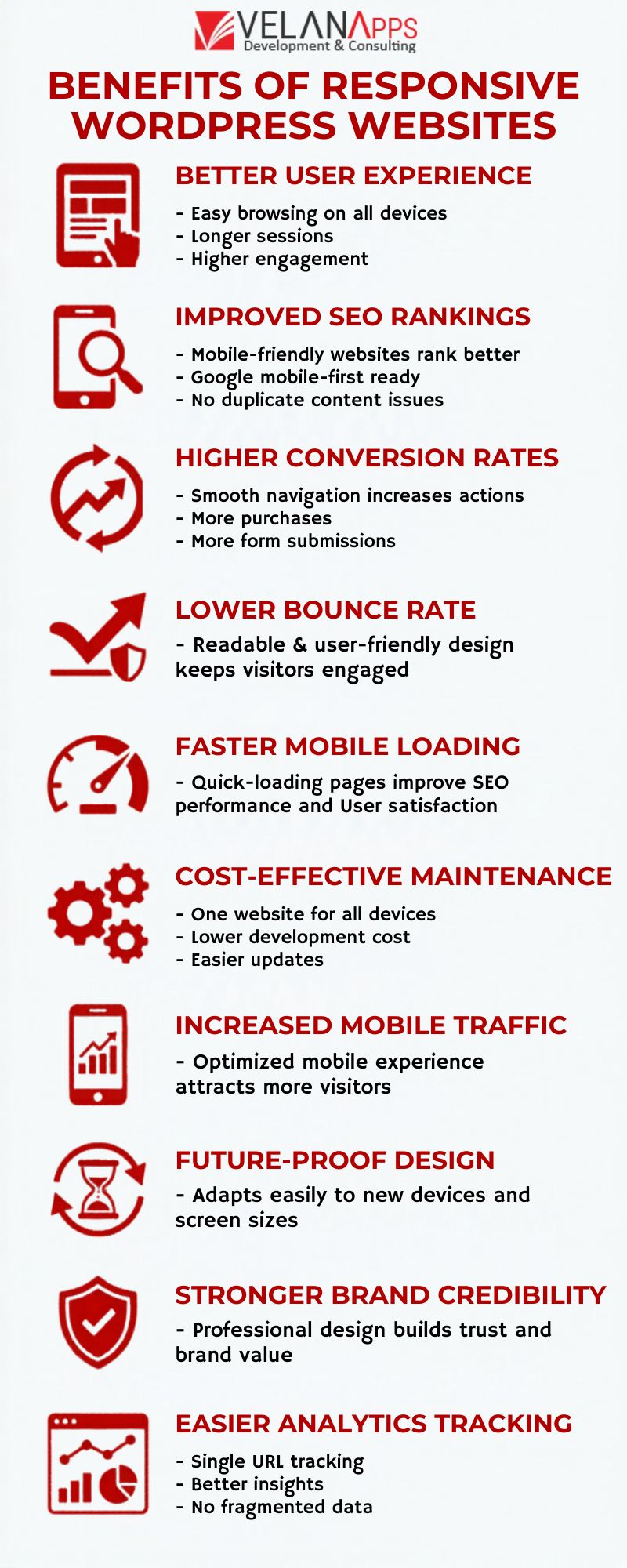
Better User Experience Across Devices
In particular, a successful responsive website user experience makes it easy for visitors to browse your website on any device. It results in longer session length and higher engagement.
Improved SEO Rankings
Improved Search Results Visibility For Responsive Design Is One Of The Biggest responsive design SEO benefits. Responsive sites solve the exact-duplicate-content problem and align with Google’s new mobile-first philosophy.
Higher Conversion Rates
The more usable your responsive website, the higher your conversion rate. The easier you make it for the user to navigate and interact with your site, the more likely they are to perform with features like purchases or form submissions (responsive website conversions).
Lower Bounce Rate
An optimized design helps to reduce website issues and bounce rate because it provides the visitor with smooth navigation and readable text, which keeps them engaged.
Faster Loading Speed on Mobile
If you want your mobile site to load quickly, proper mobile website speed optimisation is essential for SEO as well as user satisfaction, as responsive sites tend to load quickly.
Cost-Effective Maintenance
A responsive design package saves you money: since you don’t have to build two front ends, mobile and desktop, it translates into less time to develop your site, which is reflected in the price of a responsive website cost benefits for your convenience compared to a traditional website.
Increased Mobile Traffic
Website improvements translate to a significant uptick in mobile traffic growth for businesses when they tune their site for mobile users.
Future-Proof Design
If your website requires a complete redesign every few years to keep up with the speed of change, then it is failing to be a future-proof website design.
Stronger Brand Credibility
Professional layouts improve trust. An important professional website design benefit is the immediacy of building credibility with users.
Easier Analytics Tracking
A responsive design allows for easier tracking with a single URL for website analytics, single URL, avoiding data fragmentation that can come with different design versions.
How Responsive Design Improves SEO
Mobile-first indexing explained
What is mobile-first SEO? In this approach, search engines focus on how your site appears on mobile devices instead of desktops. WHAT DOES A RESPONSIVE DESIGN DO? It ensures your content is indexable (responsive design SEO).
Core Web Vitals impact
Core Web Vitals and responsiveness are essential ranking factors based on metrics such as loading speed, interactivity, and visual stability. These areas are typically where responsive websites have a better advantage.
Single URL advantage
This one simplifies your crawling and indexing with just the URL structure. This adds value to your responsive design SEO strategy and strengthens score functionality.
How to Make Your WordPress Website Responsive
Choose a responsive WordPress theme.
Use a dedicated responsive WordPress theme. Most modern themes are designed to be responsive (make WordPress responsive).
Use mobile-friendly plugins.
Choose plugins that follow mobile optimisation WordPress practices without compromising on speed.
Optimize images & media.
Resize images and implement modern formats for faster loading and improved speed.
Test responsiveness
Regular testing is essential. Top practical, responsive WordPress tips to ensure your site is device-agnostic.
Best Tools to Test Website Responsiveness
Google Mobile-Friendly Test
A mobile-friendly test tool is a better tool that tests how easily a visitor can use your page on a mobile device.
Page Speed Insights
Assists in determining velocity, making recommendations for performance optimisation on test-responsive websites.
Chrome DevTools
Smartphone emulator: An inbuilt website responsiveness checker, website previews at different screen sizes, and simulated friction as well.
Typical Mistakes of Adaptive Design
Non-responsive themes
Use of ancient themes is one of the most common responsive design mistakes.
Overloading with plugins
Having too many plugins can slow down your site and cause performance problems.
Ignoring mobile UX
Lack of proper navigation and layout results in horrible mobile UX issues that kill engagement and conversions.
Poor font and button sizing. When text is small or buttons are not easy to tap, usability suffers
Responsive vs Non-Responsive Website (Comparison)
| Feature | Responsive | Non-Responsive |
| Mobile-Friendly | ✔ | ❌ |
| SEO Performance | High | Low |
| User Experience | Smooth | Poor |
This is a very clear-cut comparison that shows the difference between a responsive vs. non-responsive website, emphasizing why responsive design is essential.
How Responsive Websites Drive Traffic & Sales
Better rankings → more traffic
Better Search Engine Optimization results in greater exposure and thus more organic traffic.
Improved UX → more conversions
A smooth web experience maximizes the responsive website benefits for business by enticing users to take action.
Reduced bounce → higher engagement
Longer, more interactive, and deeper sessions naturally assist websites in boosting their sales (increase website sales).
Conclusion
Getting a responsive site is not a choice anymore; it is a need. The advantages are obvious, from improved SEO rankings and an improved user experience to increased conversions and future-proof design. Now the question arises, ‘Why a responsive WordPress website? The answer is quite simple: it directly impacts your visibility, usability, and profitability.
Continually investing in a responsive design will keep your website competitive and user-friendly while providing you with a search engine-optimised and customer-friendly website well into the future.
Responsive WordPress Website FAQs
Why is a responsive WordPress website important?
A responsive WordPress website is important because it improves user experience, supports mobile users, and boosts SEO performance.
Does responsive design affect Google rankings?
Yes, responsive design SEO plays a major role in rankings because Google uses mobile-first indexing to evaluate websites.
How do I check whether my website is responsive?
Tools like the Google mobile-friendly test or a website responsiveness checker allow you to test your responsive website performance.
What if my site is not responsive?
As much as a non-responsive experience leads to bad mobile UX issues and you get high bounce rates, you will also end up having a relatively high ranking in search results.
How will a WordPress site be more responsive?
To make WordPress responsive, use a responsive theme, responsive WordPress tips, and mobile optimisation for WordPress.
Which WordPress themes are responsive?
Most modern themes support mobile-responsive website functionality and follow responsive web design basics.