VelanApps Responsive Web App Design Experience
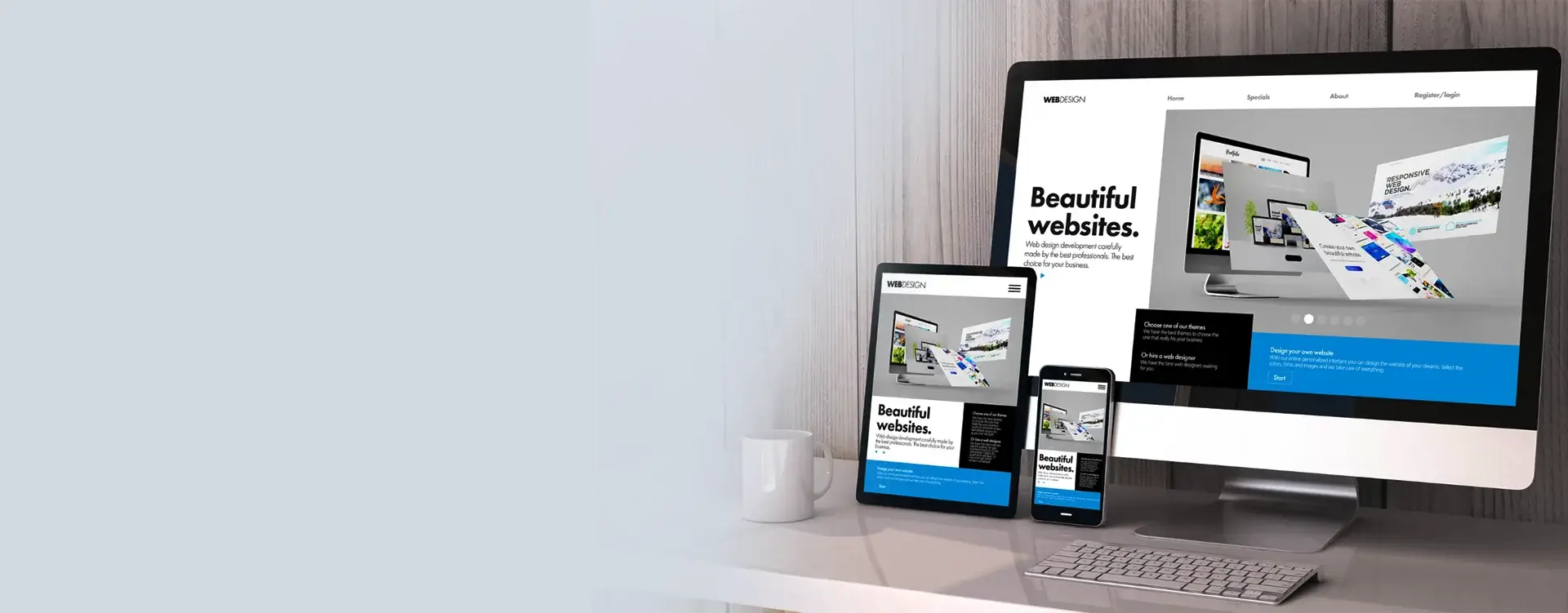
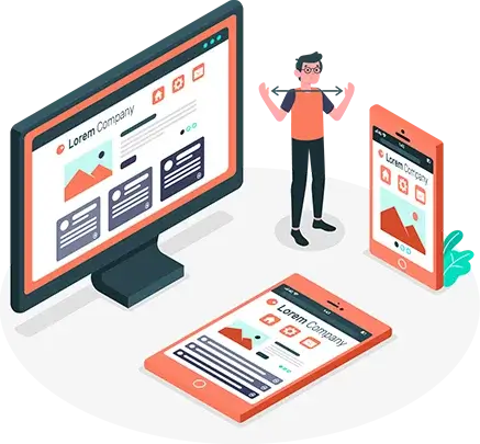
Responsive Web app Design works well with all device or screen sizes. It generally costs less than expected and eliminates the urge to install a software for better experience. It is a design that responds perfectly to the behaviour of the users. Responsive Web App Design and Development not only focuses on the screen resolution adjustments and size of the image, but it also paves the way for futuristic ideas and thoughts.
We at VelanApps are centred on arranging web applications for mobile device screens and we aim to reach higher goals by designing a smart web experience that echoes with the user's requirements. We also ensure that the quality of web applications is much higher than what is shared in the market.
Our Responsive Web App Design Services
Web Application Design usually covers specialties like UI, UX, and responsive app design.


Our Experienced Responsive Web Application Design Services Will Help You Transform Your Online Presence. Contact Us Today To Enable Seamless User Experiences Across All Devices!
Process Of Responsive Web Application Design
The process of Responsive Web Application that VelanApps follow.

Defining
The first step is to define all the system requirements by making crucial technological decisions and seizing user roles.

Designing
This process involves deciding the product's initial appearance and feel. By prioritizing features, we can plan for the release and model the user experience.

Distribute
By this time, we will move forward with the detailed specifications, time of completion, and cost estimates along with a launch plan, and our team at VelanApps will execute it as per your expectations.

Evolve
In this journey, you can track quality assurance, DevOps, and important updates related to deployment with the help of project management tools.
Responsive App Design Your Best Investment Option
More than 40% of the users do not continue interacting with a web application that does not work properly on a mobile. The chances for users to access the web on a smartphone are higher as there is more web traffic. So, it is a smart decision to invest in a Responsive Web Application as it will protect your application’s ability to adapt to desktop and mobile phones. At VelanApps, we ensure you are provided with an excellent Web Application Design approach that coordinates with your business objectives and requirements.
Digital Transformation
Script
Framework
CMS
e-Commerce
Digital Transformation
Mobile App Technologies
Database
Microsoft
Collaboration Tools
Digital Accelerator
RPA
BI
DevOps
UI / UX
Design Tools
Development & Testing
Development Tools
Project Management
Testing Tools


What Is Our Work
See our blog for the most recent information on industry news, tech developments, and professional
advice.
With our in-depth articles on a range of topics, be motivated and informed. Now go ahead and
read!
This is where our clients’ vision met our expertise. Explore some of the masterpieces we created for our clients:
Experience seamless user interaction and enhanced accessibility with our Responsive Web Application Design Services. Elevate your digital presence today – Contact us for a consultation!”
Frequently Asked Questions
Responsive Web App Design is simply a website design that ensures that the websites have a similar appearance on all devices like mobile phones, desktops, laptops, and tablets.
Today, a website's customers and visitors must be given the best experience. As most of the visitors are on smartphones or laptops, when the website works fine on both devices, it gives them a good web experience.
Yes, any existing static website can be converted into a responsive design. There is no need to start from scratch as you can carry out the activity through design and development updates.


